The Comfort and Weight of a Number
A quiet look at why range charts feel so reassuring, and why living by numbers can still leave room for uncertainty.
There is something deeply modern about the chart.
A chart promises calm. It takes a sprawling, messy human experience and folds it into rows, labels, and ranges that seem to say: here is the border between worry and ease; here is the line between ordinary and alarming; here is the shape of a day made legible. We are drawn to that promise not only because numbers look precise, but because they appear to spare us from interpretation.
Yet numbers rarely arrive alone. They travel with mood, memory, routine, and the stories people tell themselves when they glance at a reading and decide what it means about the rest of the day. A range can look objective on paper and feel strangely personal in real life.
When reassurance becomes a ritual
Many people now move through life with tiny systems of measurement close at hand. Steps, sleep, heart rate, screen time, water intake. It makes sense that blood sugar, too, often enters conversation not as an abstract medical term but as part of the wider culture of tracking. The chart becomes more than a reference. It becomes a ritual object, something consulted in moments of doubt, fatigue, discipline, or hope.
That is part of what makes these charts so compelling. They do not merely organize information. They create a feeling of orientation. A person may not be looking for a grand answer; sometimes they are simply looking for a foothold. A range offers that foothold, however briefly.
But charts also carry a quiet tension. They simplify in order to help, and in doing so they can flatten the lived texture around the number. Morning does not always feel like afternoon. A celebration does not feel like an ordinary Tuesday. Stress has its own weather. Appetite has its own logic. Routine can be steady for a week and then suddenly become improvisation.
The emotional life of “normal”
The most loaded word in any chart may be the most ordinary-looking one: normal.
Normal sounds like a destination, but it often behaves more like a social signal. It hints at belonging, steadiness, and the relief of not having to think too hard. It can feel comforting, but it can also feel judgmental, as if a human body were a student waiting for a grade.
That is why range-based language has such cultural power. It borrows the authority of science while touching nerves that are emotional, social, even moral. People do not just want a stable number. They want the story attached to that number to be manageable. They want the day to feel interpretable.
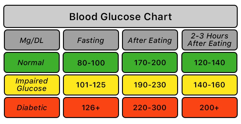
A phrase like the one in this reference on blood sugar ranges points to more than a clinical framework. It gestures toward a larger habit of mind: our desire to turn uncertainty into scale, and scale into reassurance.
The map is useful, and still not the terrain
Perhaps the lasting appeal of a chart is that it behaves like a map. It does not pretend to be the whole landscape, but it offers shape where there might otherwise be confusion. And maps are comforting even when they are incomplete.
The difficulty comes when a map is mistaken for the full experience. Human beings are rarely as tidy as the documents built to describe them. The number may be real, but so is the context around it: the skipped lunch, the restless night, the long commute, the family gathering, the quiet sense that a body can be familiar and mysterious at the same time.
This is not a rejection of measurement. It is a reminder that measurement has atmosphere. It lands somewhere. It enters a life already crowded with expectations about discipline, wellness, responsibility, and control. That is why a chart can feel soothing in one moment and heavy in the next.
A softer way to think about ranges
Maybe the most interesting thing about a chart is not the chart itself, but the kind of person it imagines. Someone attentive. Someone watchful. Someone trying to translate bodily signals into something readable. That figure has become very contemporary: the self-monitoring individual, part researcher and part narrator, always trying to understand what the body is saying.
And maybe that is the quiet contradiction at the center of all this. We reach for numbers to reduce uncertainty, yet the act of watching can make us more aware of how much uncertainty remains. The chart helps, but it does not erase interpretation. It simply gives interpretation a frame.
In that sense, these ranges are less like verdicts and more like companions to modern life. They sit beside us as we try to make sense of fluctuation, routine, and the strange intimacy of data. They offer structure, yes. But they also reveal something humbler: that even our neatest systems are, in the end, ways of living with ambiguity rather than escaping it.