When a Schedule Starts to Feel Like a Story
Some charts promise order, but what people often notice first is the feeling of trying to make uncertainty look neat.
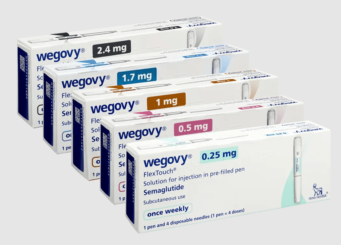
There is something oddly revealing about the moment a person encounters a dosing chart.
Not because charts are dramatic. They are the opposite. Boxes, sequences, increments, little signs of order lined up on a page. Yet the appeal of a schedule is never just visual neatness. It is emotional neatness too. A chart suggests that a complicated experience can be translated into stages, that uncertainty can be given edges, that time itself can become a kind of reassurance.
That may be why medication-related schedules hold such a specific place in modern life. They do not simply organize information; they organize expectation. They turn an invisible process into something visible. They offer a way to look at a future that might otherwise feel abstract and say: here is one possible shape of it.
The comfort of structure
We live in an era that loves tracking. Sleep is tracked, meals are tracked, steps are tracked, moods are tracked. Even rest is sometimes managed with the seriousness of a spreadsheet. Against that backdrop, a dosing guide feels almost culturally familiar. It belongs to the same world as planners, progress bars, and calendar alerts.
But there is a difference between productivity structure and body structure. When a schedule touches the body, the stakes feel more intimate. Routine becomes personal. A chart is no longer just a planning tool; it starts to feel like a quiet negotiation between caution, hope, and attention.
That tension is what makes these guides interesting beyond their practical role. They sit at the crossroads of trust and interpretation. People do not only see instructions when they look at them. They see pace. They see patience. They see the idea that some things are meant to unfold rather than rush.
Why charts feel bigger than they are
Part of the fascination comes from how modest the format seems compared with the weight people place on it. A chart can look almost casual at first glance. Yet it often carries the atmosphere of seriousness. It suggests that details matter, that timing matters, that sequence matters.
And in a culture that often celebrates speed, a schedule introduces another value: progression. Not instant transformation, not dramatic overnight shifts, but movement measured in steps. That can feel frustrating to some people and grounding to others. Usually it is both.
This is also why conversations around dosing guides tend to drift into something more philosophical than expected. They raise old human questions in a modern form. How much certainty do we really want? How much flexibility can we tolerate? When does guidance feel supportive, and when does it start to feel like pressure?
A page like this reference point becomes interesting not only for what it lays out, but for what it represents: the desire to make a complex path feel legible.
The emotional life of a timetable
Schedules are rarely just schedules. They quickly absorb mood.
On one day, a chart can feel calming, even generous. It removes guesswork from the room. On another day, the same layout can feel stern, as if the body has been drafted into a system it did not design. Neither reaction is unusual. Both belong to the strange intimacy of following a plan over time.
This is where public conversations about health often become flatter than lived experience. Online, routines are often discussed as if they are purely rational objects: simple to read, simple to follow, simple to evaluate. Real life is softer and less tidy. People bring doubt, distraction, optimism, fatigue, and interpretation to every system they use.
A chart may seem fixed, but the person reading it never is.
Between guidance and imagination
There is also a curious narrative quality to these schedules. They divide time into chapters. Start here. Continue here. Notice where you are. In that sense, even the most practical guide carries a subtle story structure. It gives the future a sequence.
Maybe that is why so many people look at these materials with a mixture of relief and scrutiny. A schedule can offer a path, but it can also invite projection. People imagine what each stage will feel like, what it might mean, whether it signals progress or simply process. The chart becomes a mirror for expectation.
That does not make it misleading. If anything, it makes it human. We are storytellers even when we are reading grids.
A small map in a culture of self-management
The wider backdrop matters. We have become used to managing ourselves through interfaces: dashboards, reminders, portals, settings, timelines. In that environment, a dosing schedule does not look foreign. It looks like another small map, another attempt to translate uncertainty into a series of manageable moments.
And perhaps that is the quiet lesson hidden inside its design. Not that life can be fully controlled, but that people keep building structures to live beside uncertainty without being swallowed by it.
A chart does not solve the mystery of the body. It simply offers a way to move through that mystery with a little more shape. Sometimes that is what people are really looking for—not a perfect promise, but a rhythm they can recognize.
https://canadianinsulin.com/articles/navigating-the-retatrutide-dosage-chart-for-safe-dosing/