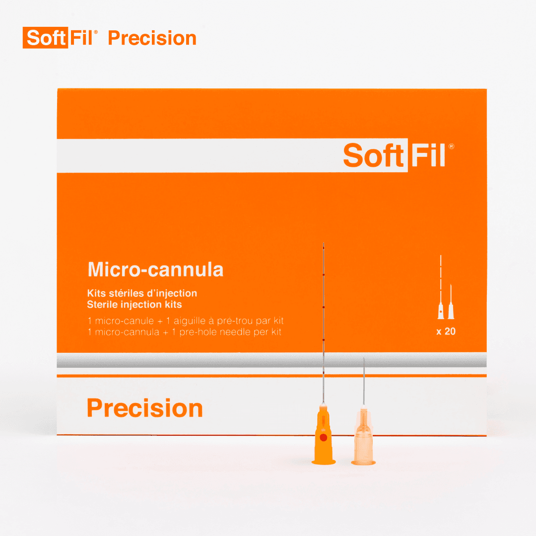
When Care Arrives in Pocket-Sized Form
Some objects do more than function. They change the mood of a room, the language of routine, and the way care is quietly carried.
Some products announce themselves with noise: glossy promises, oversized language, the feeling that they want to become the center of a person’s life. Others seem to do the opposite. They suggest that the real ambition is to fit in, to become ordinary enough that a day can keep moving.
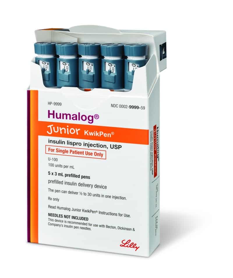
That was my first thought after seeing a junior pen device. Not the technical side of it, not the category it belongs to, but the design story hiding inside it. There is something deeply human about the way certain tools are made smaller, lighter, and more approachable. It says a lot about who we imagine care is for, and how gently we hope it can be carried.
The emotional weight of small things
A compact object can still hold a lot of feeling. In fact, sometimes smaller things carry more meaning because they seem built for the intimate parts of life: a pocket, a backpack, a kitchen drawer, the side compartment no one else notices. These are the places where routine lives. Not in dramatic moments, but in repeatable ones.
There’s a cultural shift tucked inside that idea. We used to treat tools related to health as if they needed to look serious in order to be taken seriously. Hard edges, stark colors, a kind of institutional distance. But over time, people have begun to expect something else. Not less trust, but less intimidation. Not less purpose, but more ease.
That’s especially noticeable when a product is associated with younger people. The very existence of a “junior” version of anything implies a different design philosophy. It recognizes that size is never just size. Scale changes experience. A tool made for a smaller hand, a shorter attention span, or a more delicate daily rhythm is really a tool made with empathy in mind.
Ordinary design, extraordinary signal
What fascinates me most is how these objects communicate without saying much. A pen-shaped device, for example, borrows the visual language of something familiar. That matters. Familiarity has its own kind of softness. It can lower the emotional temperature of a moment.
There’s a quiet brilliance in products that don’t insist on feeling like machinery. They meet people where life already is: in school bags, on countertops, between errands, before dinner, after a long day. The form tells a story before the function is ever explained. It says: this belongs among the other things you carry.
And maybe that’s what modern care increasingly looks like—not an interruption, but an integration. Not a giant spotlight, but a lamp switched on in the corner. Enough to see by. Not enough to dominate the room.
The hidden aesthetics of reassurance
We don’t often talk about aesthetics in this space because it can sound trivial, as if appearance sits far away from importance. But appearance shapes mood, and mood shapes experience. The color, the scale, the name, the smoothness of an object in the hand—these details do not replace meaning. They become part of it.
A product with a name that sounds more approachable, or a form that looks less daunting, can subtly change the atmosphere around it. It can make routines feel less ceremonial and more livable. That doesn’t erase complexity. It simply changes the texture of encounter.
For families, especially, this matters. Household life is already full of negotiations: time, attention, comfort, predictability. Any object that enters that environment becomes more than itself. It becomes part of the room’s emotional weather. Is it calming? Is it awkward? Does it invite resistance, or does it blend into the existing choreography of everyday life?
These are not technical questions, but they are real ones.
A quieter kind of innovation
When people talk about innovation, they often mean bigger speed, louder novelty, or a breakthrough dramatic enough to deserve a headline. But there is another kind of innovation that rarely gets celebrated. It lives in refinement. In making something less imposing. In understanding that usefulness sometimes looks like restraint.
A smaller, more considered tool suggests a philosophy of care that is less about spectacle and more about companionship. It doesn’t ask to be admired from a distance. It asks to be lived with.
That, to me, is the interesting part. Not the product alone, but the worldview around it. The idea that support can be designed to feel less like an event and more like a rhythm. Less like a disruption and more like a sentence that fits naturally into the paragraph of a day.
Maybe that is why certain objects linger in the mind. They remind us that design is never only about shape. It is about permission: permission for life to remain recognizable, even when it asks for care. And sometimes the most thoughtful thing an object can do is become small enough—visually, emotionally, practically—to let the person holding it feel larger than the routine around it.